COMM-105-003

September 30, 2008

Photographer’s Body of Work Review: Andy Goldsworthy

Filed under: Reviews — Tags: , , , , , , , , , , , — rebeccaprowler @ 10:39 pm


Andy Goldsworthy


Andy Goldsworthy is a nature installation photographer.  His artwork focuses on abstract photography.  In his photos, the visual look matters more than the emotion felt by the viewer.  The objects in his photographs are always found in nature, never manmade.

Goldsworthy pays great attention to detail.  Classic artistic elements such as line, color, shape, space, value, texture, and symmetry are present.  This can be demonstrated in individual photographs from Goldsworthy’s body of work


This photo wouldn’t be successful without the line in the snow.  It would simply be a picture of snow with a relatively flat color scheme and nothing of interest.  The line leads the viewer’s eye through the photograph.
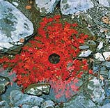


This photo displays how Goldsworthy uses color.  If the leaves were a similar shade to the rocks and the water, the photograph wouldn’t be as interesting.  The red is a direct complement to the neutral grey rocks.


Without the circle of colored stones, this photograph wouldn’t make sense.  The circular shape in the center draws the viewer’s eye into the photo and makes it visually intriguing.


The negative space is what makes this photograph.  Without the opening in the largest ring, the smaller ring wouldn’t be visible and the photo wouldn’t be as compelling.  However, the photograph is very monochromatic; it could use a bit more contrast between the color of the snow and the color of the sky.


The warm color gradient in this photograph demonstrates how Goldsworthy uses value in his work.  The exact selection and arrangement of leaves creates a seamless gradient.


In comparison to the previous photograph, the gradient of the colors in this one isn’t as gradual, so the texture of the stones is evident.


The concentric circles in this photograph demonstrate the symmetry in many of Goldsworthy’s works.  In this case, the similar coloring works to make the symmetry more obvious.
September 23, 2008

Photo Essay: Letters


Photo Essay


It took me a while to come up with a topic for this assignment.  I wanted something that would look cohesive, but the photos were connected in a more abstract, not-so-obvious way.  At first glance, the subject is not easy to distinguish, but it becomes apparent after looking through all of the photographs.

I walked around campus and my dorm room looking for letters of any kind, and I attempted to capture them in a unique way: from a different angle, zoomed-in, etc.

September 22, 2008

Photo Review: Dovima with elephants by Richard Avedon

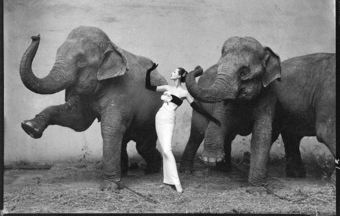
Dovima with elephants, evening dress by Dior, Cirque d'Hiver, August 1955

Dovima with elephants, evening dress by Dior, Cirque d'Hiver, August 1955

This photo by Richard Avedon is well-known for a reason.  At the time, the contrast between the dirty elephants and the clean, elegant model was unheard of.  Nowadays, this is not as jarring.  Artists constantly push the boundaries, and society as a whole is not as conservative as we were in the 1950s.

What really makes the photograph unique is the textures: the rough elephant skin and the smooth fabric of the dress.  There is also a contrast between the tones, which is further emphasized because the photo isn’t in color.  The elephants are grey while the model in her dress is black and white.

If I had to reshoot this photo, I would correct two things.  There is a definite balance of symmetry from left to right except for the third elephant on the right side.  Also, I like that the model is imitating the elephants lifting their trunks, but I wish the dress flowed out or she stuck her leg out away from her body or something similar to copy the way the elephants are lifting their right legs.

September 14, 2008

Illustrate a Word: Repetition


American Apparel T-shirts

American Apparel T-shirts

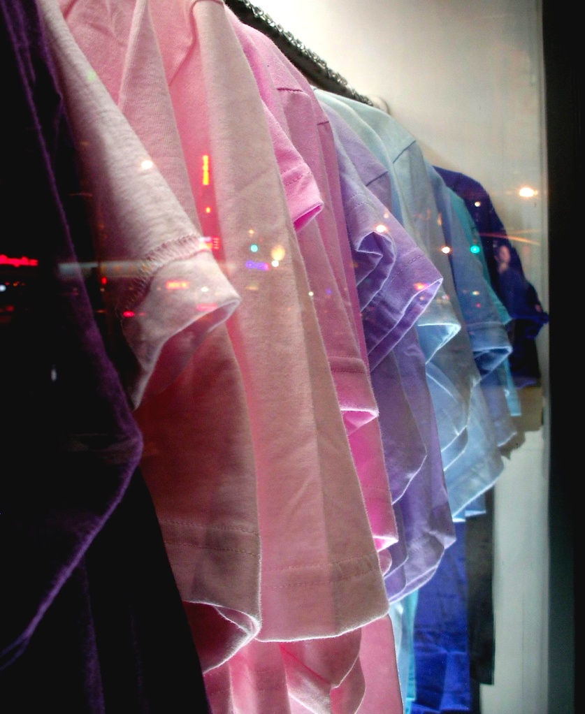
While I was in Georgetown this weekend, I saw this row of tshirts in the window of the American Apparel store on M street. The store was closed so I couldn’t go inside, but I decided to take a picture through the window anyway and see how it came out. Luckily, I was able to focus it well, and the lights reflected in the window make the photo more interesting.

The photograph demonstrates repetition without being boring because the different colored tshirts make the visual more appealing. The lighting underneath the rack of shirts makes them seem to glow.

Blog at WordPress.com.